Mobile UX · IA · UX Guidelines · Diebold Nixdorf via MING Labs

Diebold Nixdorf
NAMOS.

Retail & Gas Station POS System

NAMOS began as a retail mobile app for stores — built from a blank page. It grew into a cashier system. Then the same design language was transferred to an entirely different context: the gas station. One coherent UX thread across three very different products.

Diebold Nixdorf NAMOS

Background

Same Problem. Three Different Contexts.

NAMOS started as a retail app — a mobile tool for store staff to find, select, and purchase items for pickup. There was no existing product to inherit and no established design language to extend. Everything was designed from zero: information architecture, interaction model, UI, and the brand-related guidelines that would hold it all together.

As the project matured, the same UX thinking was applied to the cashier system — bringing order to a transaction flow that had to work under real-world pressure. Then came the hardest test: transferring that design language to an entirely different physical and operational context. The gas station.

One design language.
Three completely different products.
NAMOS Information Architecture

Mobile app for retail stores — information architecture and UI built from scratch, designed for staff buying workflows in real store environments.

Design Process

Built In Three Acts.

01

Retail Mobile App — IA from Zero

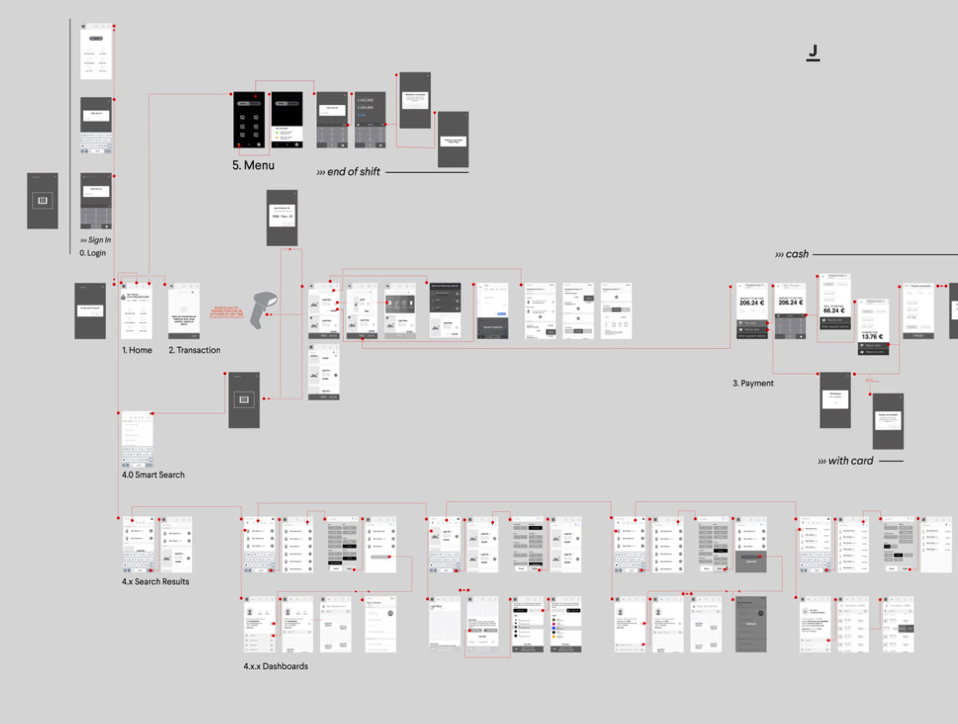
The project began with a blank page: no prior product, no inherited structure, no existing navigation pattern to adapt. The information architecture for the mobile store app was built entirely from first principles — mapping the store buyer's workflow, structuring the product catalogue, and designing a purchasing journey that matched how staff actually operated on the shop floor.

02

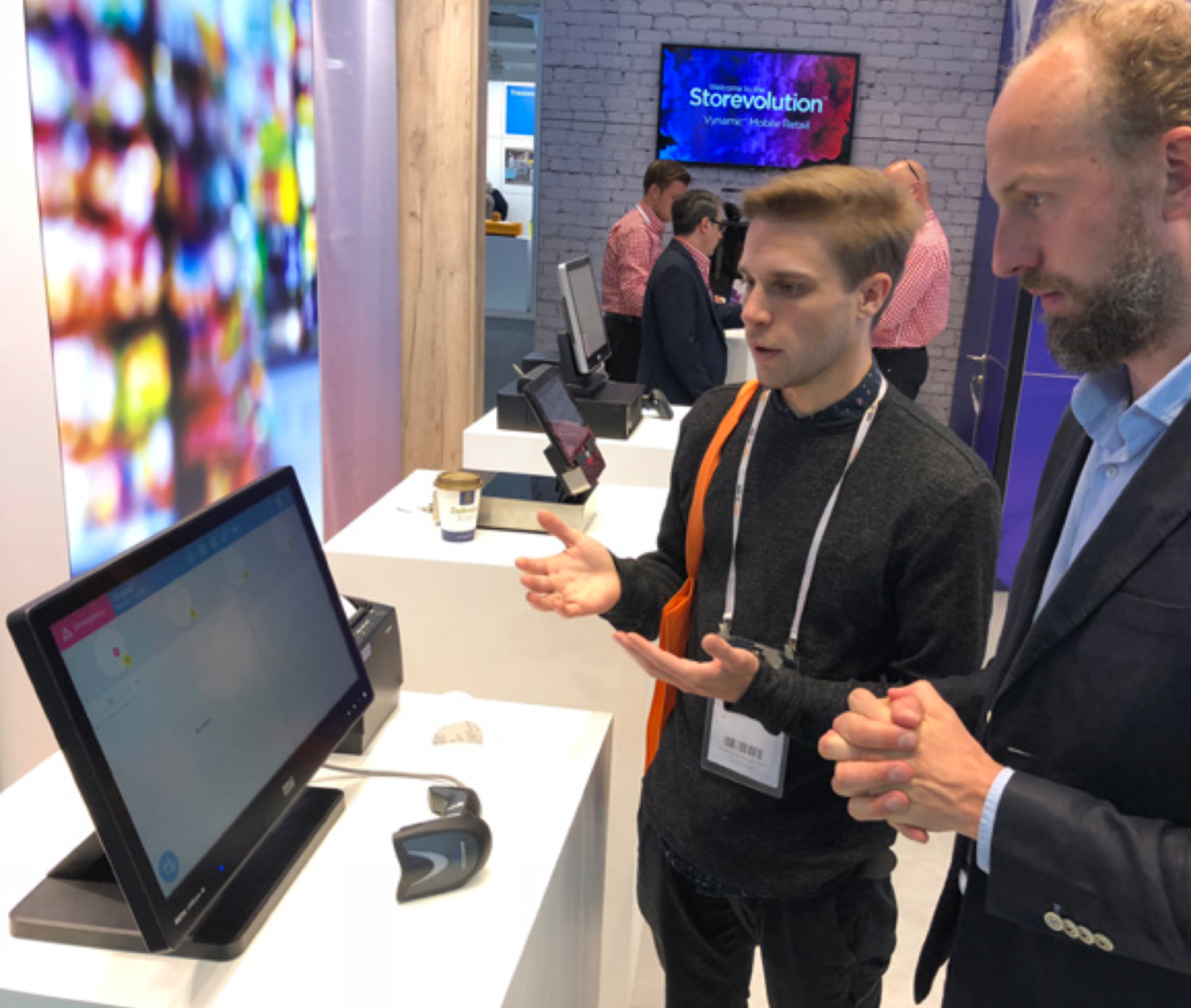
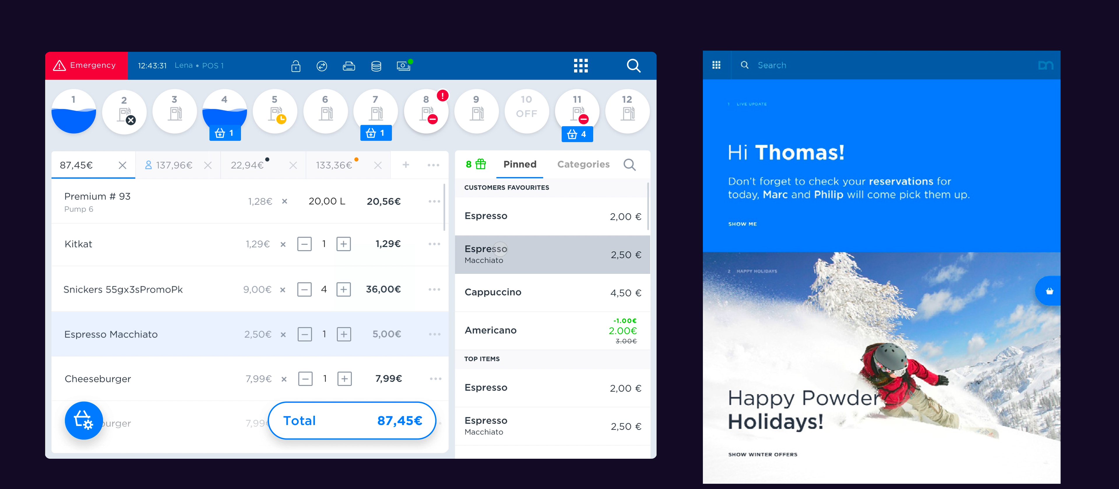
Cashier System — Translating To A New Context

The design logic developed for the mobile app was then applied to the cashier system — a fundamentally different interface with different time pressures, different interaction patterns, and different user needs. The challenge was to preserve consistency without forcing a mobile paradigm onto a stationary POS context. The underlying IA principles travelled well; the surface-level UI was rethought from scratch.

03

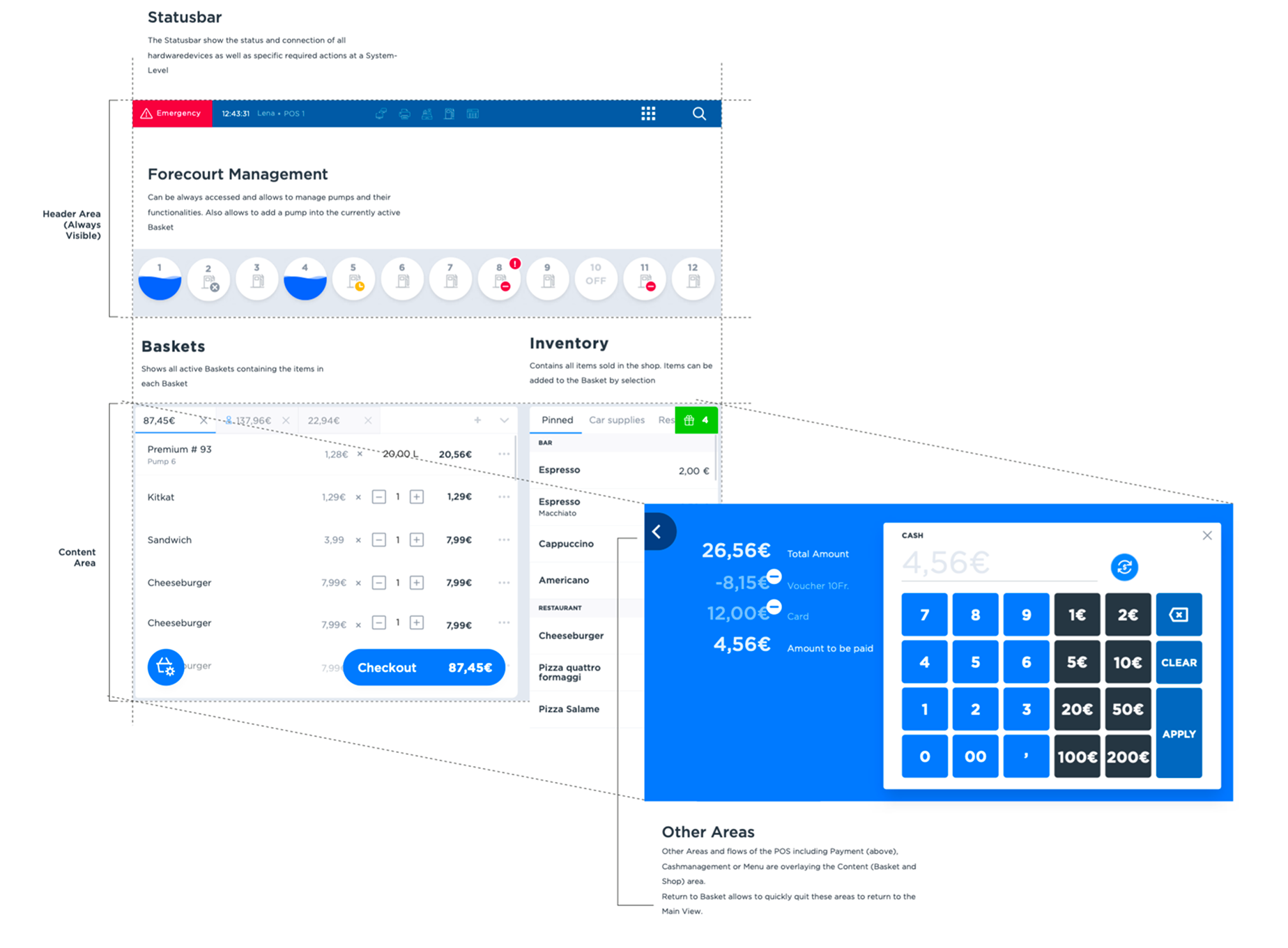
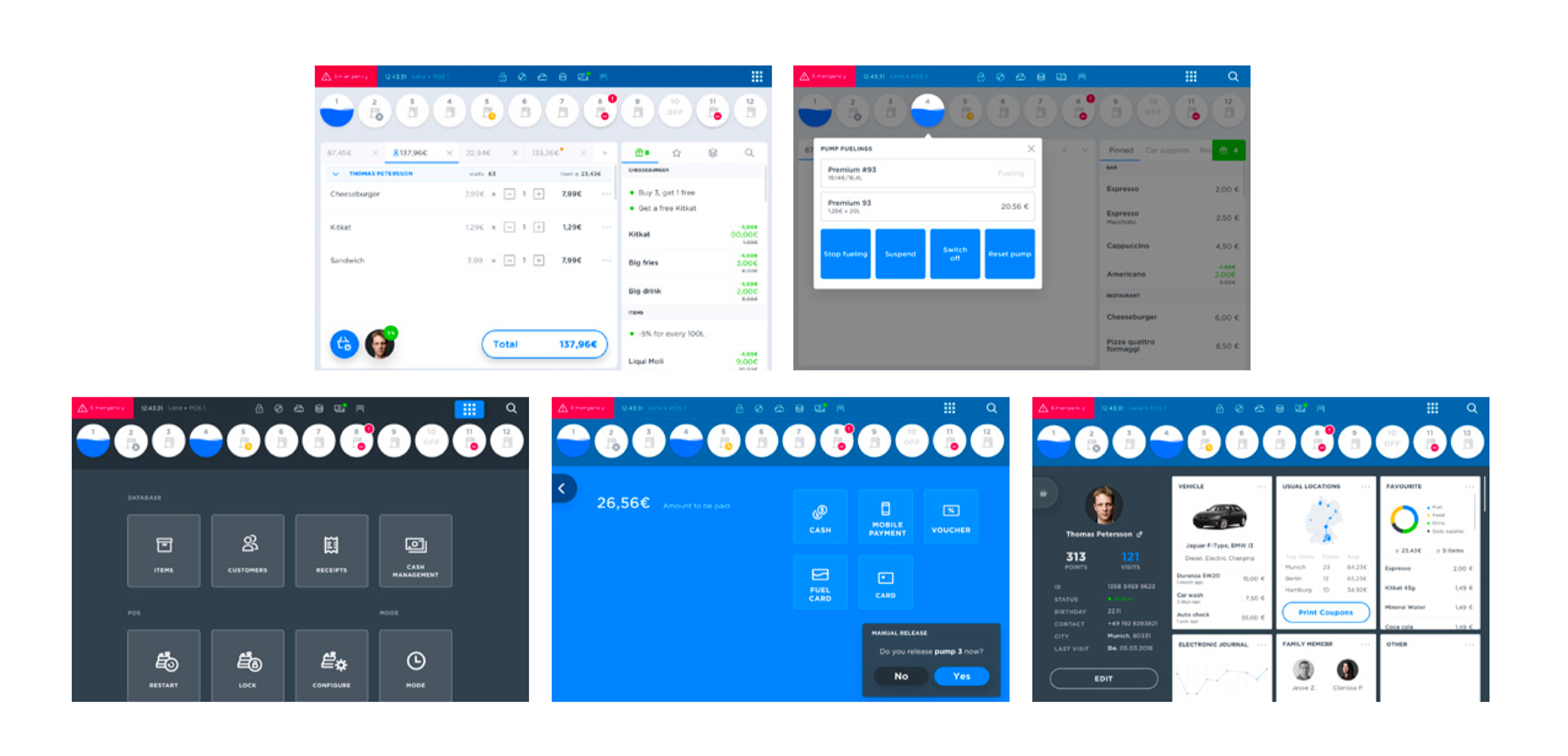
Gas Station — The Third Context

Bringing the retail experience to the gas station meant designing for an environment with even less margin for error. Staff are managing multiple systems simultaneously — forecourt pumps, in-store sales, payment flows — often under time pressure. The IA work here focused on keeping the most critical functions always visible, and adapting the navigation logic that had worked in the retail app to a much more operationally complex environment.

04

IA Documentation

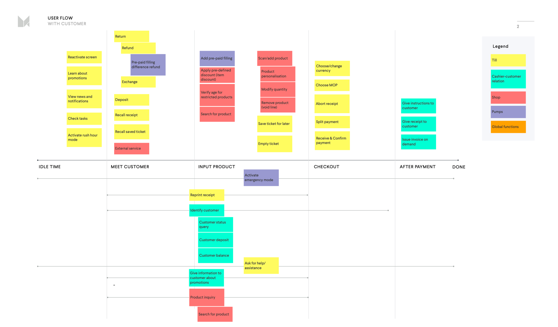
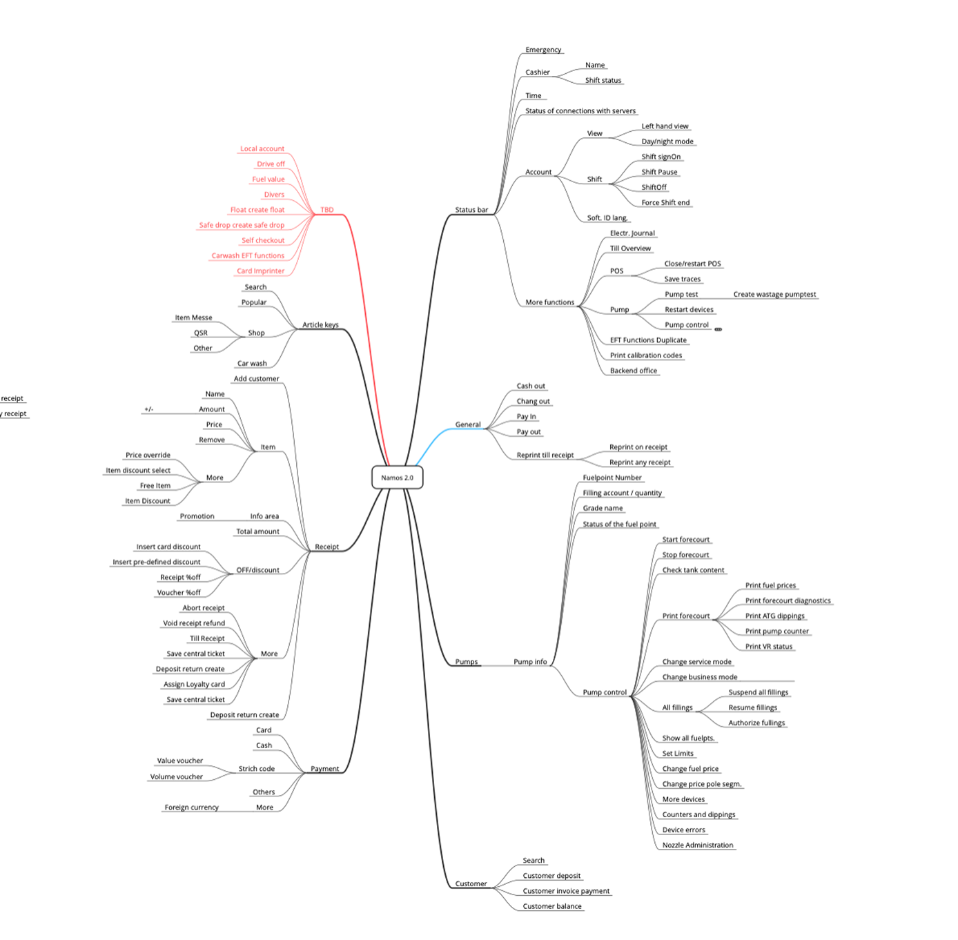
For both the mobile app and the gas station product, formal information architecture documentation was produced — flow diagrams, navigation maps, content hierarchies, and annotated screen logic. These documents served as the foundation for development handoff and as references for onboarding future team members to the product's structural rationale.

05

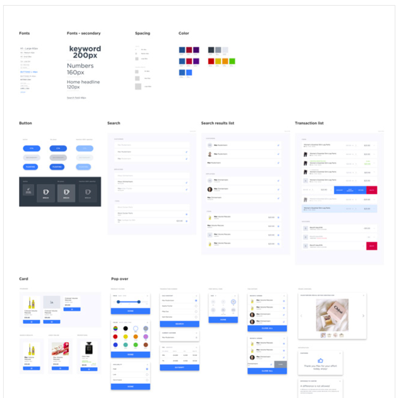
UI & Brand-Related UX Guidelines

Spanning all three product contexts, a set of UI and brand-related UX guidelines was developed to ensure cross-platform consistency. The goal was a coherent product family — where a user moving from the store app to a cashier terminal to a gas station interface would encounter the same underlying design logic, even as the surface adapted to each environment.

Gas Station POS Structure

Gas station POS — structural overview of the forecourt management interface.

Craft & Scope

Starting Point

Zero

The retail app IA was built from scratch — no prior product, no existing navigation pattern, no inherited structure to adapt.

Contexts

3

One design language stretched across retail mobile, cashier POS, and gas station — each with distinct users and operational pressures.

Output

IA + UI

Information architecture, UI design, and brand-related UX guidelines — all aligned around cross-platform consistency.

The discipline NAMOS demanded was structural thinking. When a product has to work across three different contexts — with different users, different hardware, different operational tempos — the only thing that holds it together is a very clear information architecture and a very disciplined set of guidelines. There's no room for improvisation.

Starting from scratch on the retail app turned out to be an advantage. Without legacy decisions to work around, every structural choice could be made on its own terms — which made the subsequent translations to cashier and gas station significantly cleaner.

Project Details

My Role

UX Designer
Information Architecture
UI & Brand UX Guidelines

Team

MING Labs UX Team
Diebold Nixdorf Product Team
Engineering & Product Owners

Context

Client project via MING Labs
B2B retail & industrial
Multi-platform product family

Project

Retail App · POS · Gas Station
Diebold Nixdorf / NAMOS
2018–2019