Design Process
Diagnose. Prove. Build. Roll Out.
01
Diagnosing The Root Cause
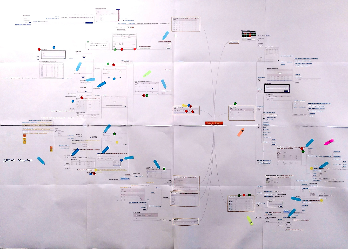
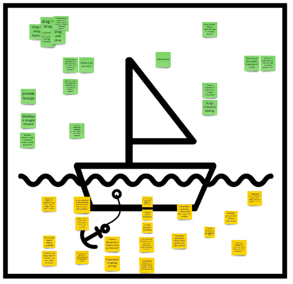
Mapped the full scope of the problem across design and engineering — duplicate components, inconsistent patterns, accessibility gaps, and documentation debt. Framed it not as a UX problem but as a systemic architecture failure affecting every team's velocity and every user's experience.
02
The 2-Week CTO Pitch
Rather than requesting a large budget or a long roadmap, I pitched a time-boxed proof of concept: one designer, one developer, two weeks to build a working component library. The constraint made the proposal easy to approve — and the outcome made it impossible to reject. The library was built on schedule.
03
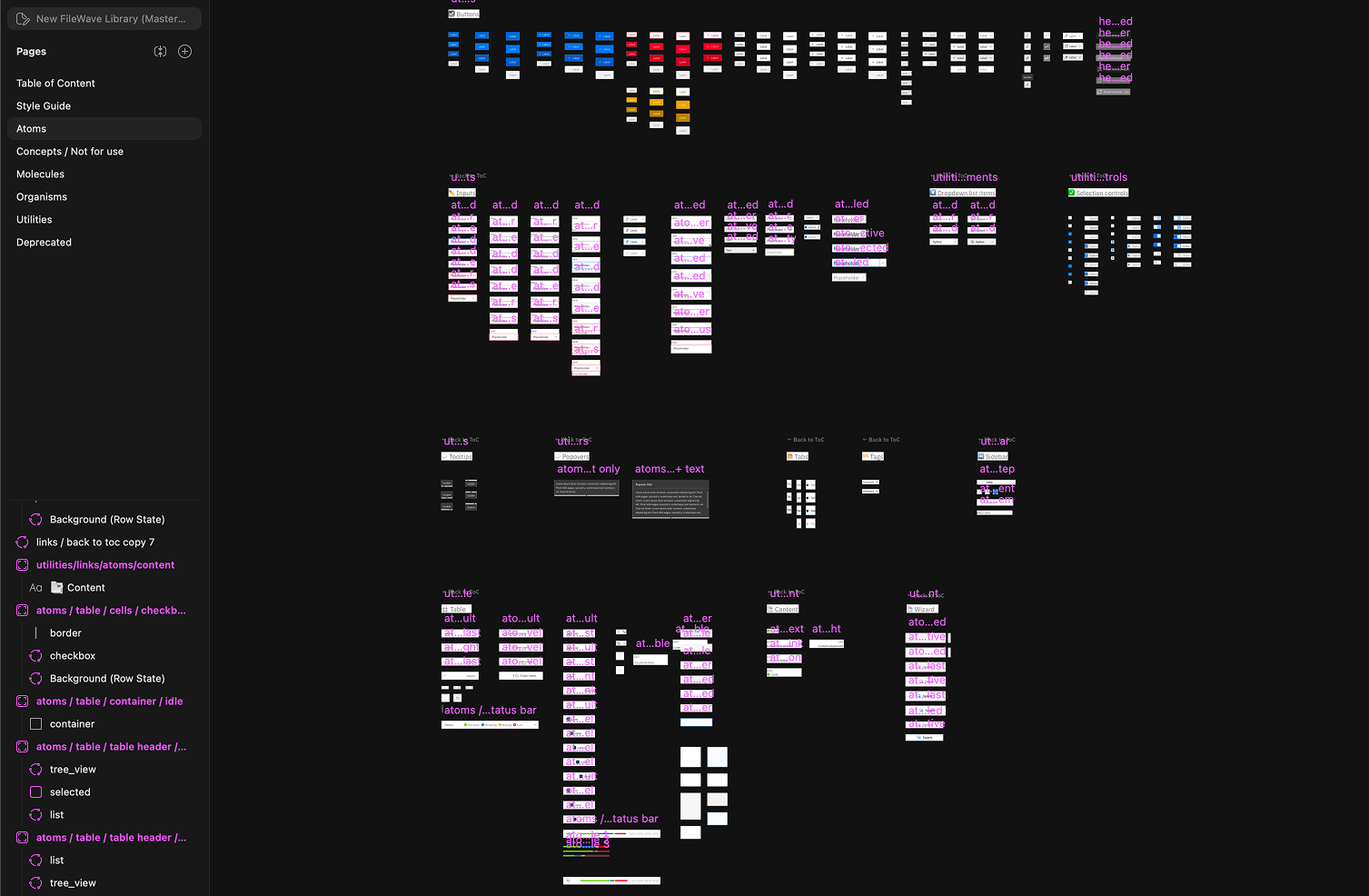
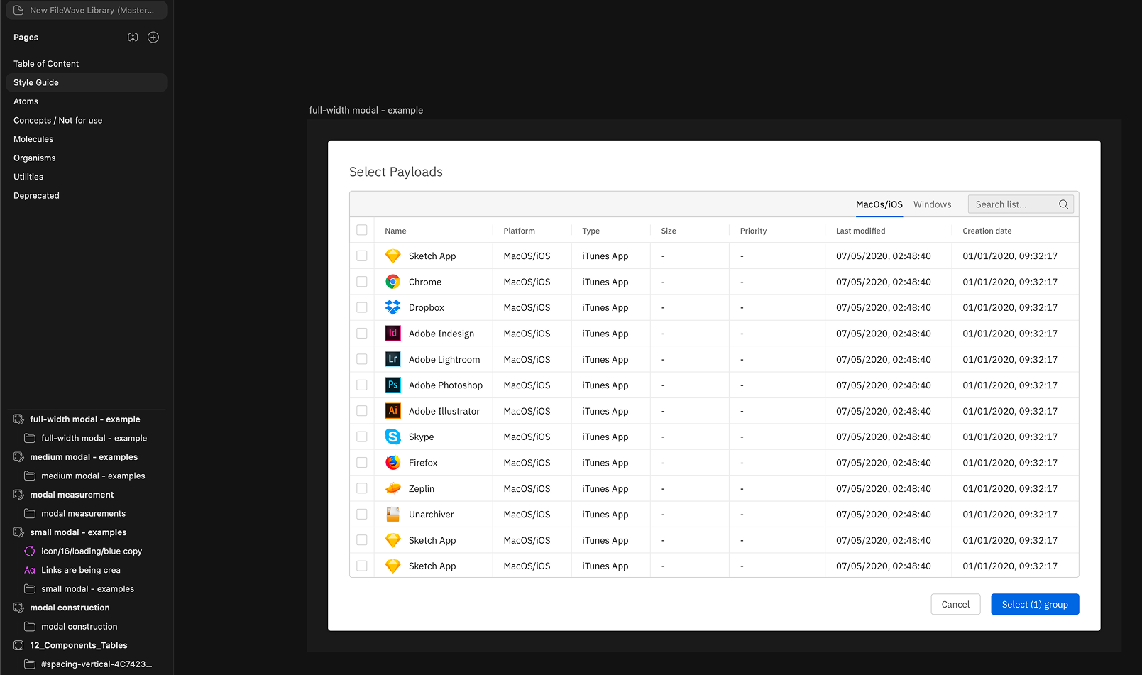
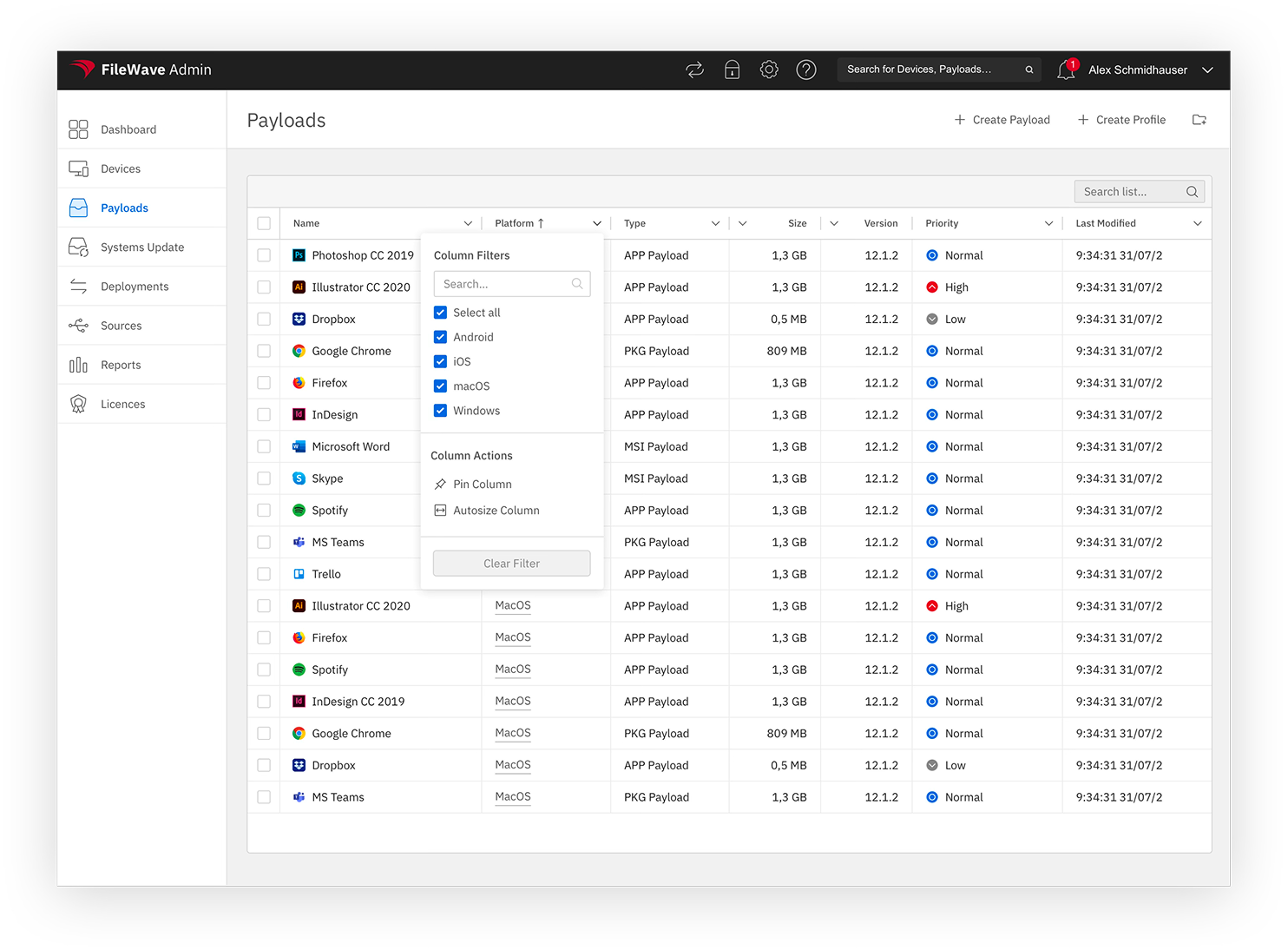
Building The Component Library
Designed and documented 82 production-ready components with full design token support — covering typography, colour, spacing, and interactive states. Each component was built once, spec'd for both Figma and code, and made accessible to WCAG standard from day one rather than retrofitted later.
04
Design Tokens & WCAG Compliance
Introduced design tokens as the single source of truth linking design decisions to implementation — enabling consistent colour, spacing, and typography across the entire product. Simultaneously elevated accessibility standards: improved contrast ratios, full keyboard navigation, and screen reader support built into the component architecture.
05
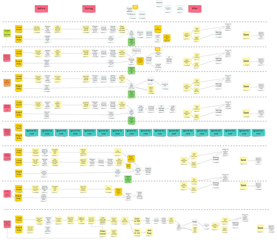
Product-Wide Rollout Strategy
Developed a phased rollout strategy to migrate all 12 product sections and 110 documentation pages to the new system — without halting ongoing feature development. Ran alignment sessions across design and engineering squads to ensure adoption was consistent and the old component patterns were fully retired.